App & Website Testing for Food Delivery Startup
Challenges:
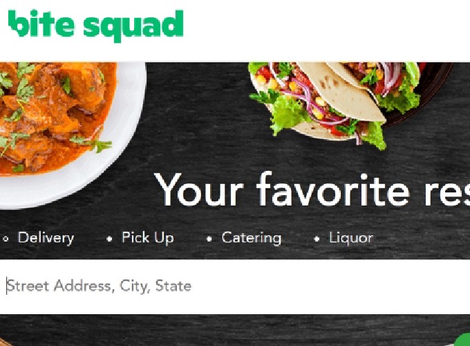
Bite Squad was about to launch in 200+ new locations. Before this big step, the product teams wanted to learn more about the usability of the new interface and how their target audience perceives their product in comparison to other food delivery apps. They wanted to gain insights for potential directions and test some of the new features.
Process:
1. Remote Automated Usability & Competitive Testing
I designed a remote automated usability test on usertesting.com. The goal was to elicit information from users about appeal and user-friendliness of the website in comparison to the first-tier competitors; to understand which aspect of the Bite Squad product appeal them the most, and what do they like and not like about the interface?
After answering a set of questions on design, participants have been given 3 different scenarios and asked to complete certain tasks designed based on the concerns and priorities of the product teams. I also asked the participants to complete the same tasks on a first-tier competitor’s website. Remote tests have been video recorded. I analyzed the recordings and prepared a list of key points that shaped the moderated usability test.

2. Moderated Usability & Competitive Testing
Based on the insights from the product teams and information collected from the automated usability tests, my co-researcher and I, we prepared a combined usability and competitive test on the recently developed IOS app.
We recruited 6 main and 1 test participants based on the targeted user demographics provided by the team. After running the test with the test participant and making the necessary wording changes, we scheduled tests with main participants.
At the beginning of the usability test, we conducted a pre-test interview with each participant to collect data on user personas, gather information on potential users’ eating and food ordering habits. Following this initial interview, we gave participants the same 3 scenarios that were used at the automated usability test and ask them to complete specific tasks such as adding items to the cart, changing item details, and removing items from the cart.

One of the Key Insights: Users find it easy to add but hard to remove items from the cart.
“Adding to the cart was quite easy. I went into the cart. Yet it is not immediately clear how to delete [items]. I expect to see an ‘x’ sign.” –Participant #3
“There should be an option to change the number of items on your cart. Here there is only ‘add more items’ option. I don’t know how to do this.” –Participant #2
We asked participants to complete the same 3 tasks on a competitor app. We noted their completion, mistake, and success rates. We kept probing questions and encourage them to compare the two apps throughout the test.
Following the competitive test, we conducted post-test interviews to gain insights on overall user-friendliness and appeal of the product. We encouraged the participants for a blue-sky brainstorming on their ‘ideal’ food delivery app.
Output:
Based on what we had learned along the research, we put together a presentation with two sections. In the first section, we analyzed user pain points and suggested viable design solutions to resolve existing issues. In the second section, we translated users’ comments into design ideas and suggested new directions for research and development.
Outcome:
This project is still in progress. The product leaders decided to incorporate some of our suggestions into the new interface. I can’t wait to see the result and test it again.


